Over the years I've been fortunate to work with some great designers who have understood the web intrinsically. I've also worked with a few who, while perfectly talented creatives, maybe didn't have the background or the appreciation to really make the most of the web as a medium.
I'm not a designer, so this isn't me trying to say "here's how you should design a website". As a developer I just love to work with graphic designers who fully grasp the limitations and possibilities of the web platform - it makes the development of a product so much more inspiring and creative, and the end result always benefits.
So with that in mind, for any designers reading this who may be earlier in their career or are looking to transition to designing for web, here are a few things that I (as a developer) would love you to keep in mind, and exercise your creativity around.
1. Remember there's a user
Let's start with an obvious one. Ultimately, there's someone at the other side of the screen, directly interacting with what you've created.
This means there's input, navigation, gestures and a very real need to make sure your designs don't just look nice, but are functional - either by effectively conveying whatever information needs to be conveyed, or by allowing users to easily find and perform any tasks which they may need to carry out within your project (ranging from the simple - opening a navigation menu, to the complex - filling out a multi-step form to apply for a loan).
Sorry but how could I not use this stock image?
You also probably don't know who the user is. You don't know their background, you don't know what their understanding is of your platform (or technology in general), you don't know if they have any impairments which change the way in which they interact with what you're designing. Basically, don't make any assumptions and ensure that what you create is as accessible as possible to the widest range of users, at least within sensible constraints given your project. If designing for accessibility doesn't come naturally to you yet, there are tons of great resources online, including this excellent article.
If you're lucky enough to work with a team you may have UX experts who can take on some of the load in this area, but even in this scenario it's important that when you're mocking up their wireframes and user flows, that the designs simply put meat on the bones and don't hide, change, add to or remove any of the product's important functionality. (Side note: this is why it's so important that every team member working on a project has a thorough understanding of the project's context and overall goals).
2. Remember that websites are non-linear (and that's how users consume them)
It's tempting when designing something, or creating any piece of content, to think that users will see it the same way as you do. That they'll pore over every piece of information and make sensible, well-informed decisions about what to do next.
In reality, this couldn't be further from the truth - as Steve Krug points out in his phenomenal UX book Don't Make Me Think "what users actually do most of the time (if we're lucky) is glance at each new page, scan some of the text, and click on the first link that catches their interest or vaguely resembles the thing they're looking for. There are almost always large parts of the page that they don't even look at. We're thinking 'great literature' (or at least 'product brochure'), while the user's reality is much closer to 'billboard going by at 60 miles an hour')".
This reminds us that we need to make things as easy as possible for our users, no matter how they're using our website or where they're coming from. They might have navigated directly to your home page, or they might have landed from a search engine 3 breadcrumb levels deep, on a page you've forgotten even existed. If you want your users to do or find something, make it obvious, repeat it if necessary and don't be too quick to throw away conventions.
3. Remember there's a viewport, and that it's seldom the same between two users
There are few things more infuriating as a developer than receiving designs which have been created at a single static resolution with no consideration for how things might scale at different window sizes and on different devices.
You might be designing a page on a 1920 x 1080 monitor, on a 1440 x 900 canvas in Figma, but please remember that a version of this page needs to exist, and look at the very least passable, at every likely resolution above and below this. It's not necessarily your job to mock all of this up (although the occasional doodle or annotation is helpful) but you very much need to have this in mind when laying out a page's elements, so that whatever you hand over to your developers is at least possible.
A common example of this I see are mobile website designs which are created at 375 x 667 (standard iPhone resolution) and have all of the content fit perfectly within this viewport, the implication being everything is visible and the user shouldn't have to scroll. There are a couple of problems with this:
Firstly, 375 x 667 is the device's resolution, not the resolution available to the web page (which might be more like 375 x 550 taking the browser controls, location bar etc into consideration).
Secondly, this is just the resolution of one device - building on our example above, if you want to ensure multiple elements are visible on page at all times and are positioned relative to the viewport, you need to be thinking about how this will fit on the smallest reasonable device size (around 320 x 500 is a safe bet). The developer can then extrapolate upwards from there.
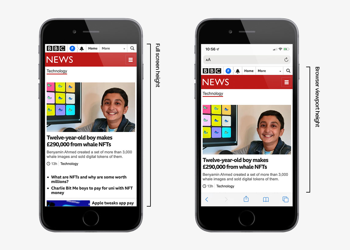
As you can see, there's a considerable difference between the height of the device's screen, and height available in the browser. This is just one example, on one device, in one browser but to be safe it's best to start with the worst case scenario (the smallest possible device) and work upwards from there.
4. Remember that everything doesn't have to be static
One of the beautiful things about the web is that it's not a static canvas like a poster or magazine cover - things can shift, animate and transition to delight and inform the user. This of course needs to be done appropriately and with a light touch, but just open your mind to it and think about how different elements can transition and change to tell the story you want to tell with the content, or help your users perform their tasks more effectively.
Perhaps certain elements of the UI can get out of the user's way when performing a particular task, perhaps tertiary information can be hidden in a slide-over panel or modal instead of navigating the user to another page to create a more seamless journey. These are simple examples, but are the kinds of things you should be thinking about if you're not already.
Depending on the tools you're using and your experience level, you may not feel you have a lot of options to mock up full, production ready, animations to be handed over to development - that's not a problem. As developers we have a lot of great techniques which allow us to roll out UI animations with relative ease. If you give us an idea of how you want something to move, when, and what triggers it we can drop a simple animation into the project and then work with you to refine it and get it looking as good as possible.
If you are keen to start mocking up and visualising some transitions and feel held back by your current design package, Figma has a very robust mock up system which allows you to create some pretty polished transitions (although I'm sure there are lots of other great options out there too).
5. Remember to embrace the possibilities
The web is this ever-changing, wild, beautiful, infinite canvas. Don't let the traditions or semantics of how a document should be laid out hold back your creative process. If the project calls for it feel free to explore shape, sound, layout, native APIs and deep interactivity to bring additional meaning, context or delight to the user experience.
As I touched on in point 1, keeping the end-user and all relevant constraints in mind are absolutely paramount too - but somewhere in the middle ground between constraints and possibilities are where the really exciting, amazing stuff lies - and that's what I want to be building.